
Why is colour important in marketing?
Source: @ro_ka
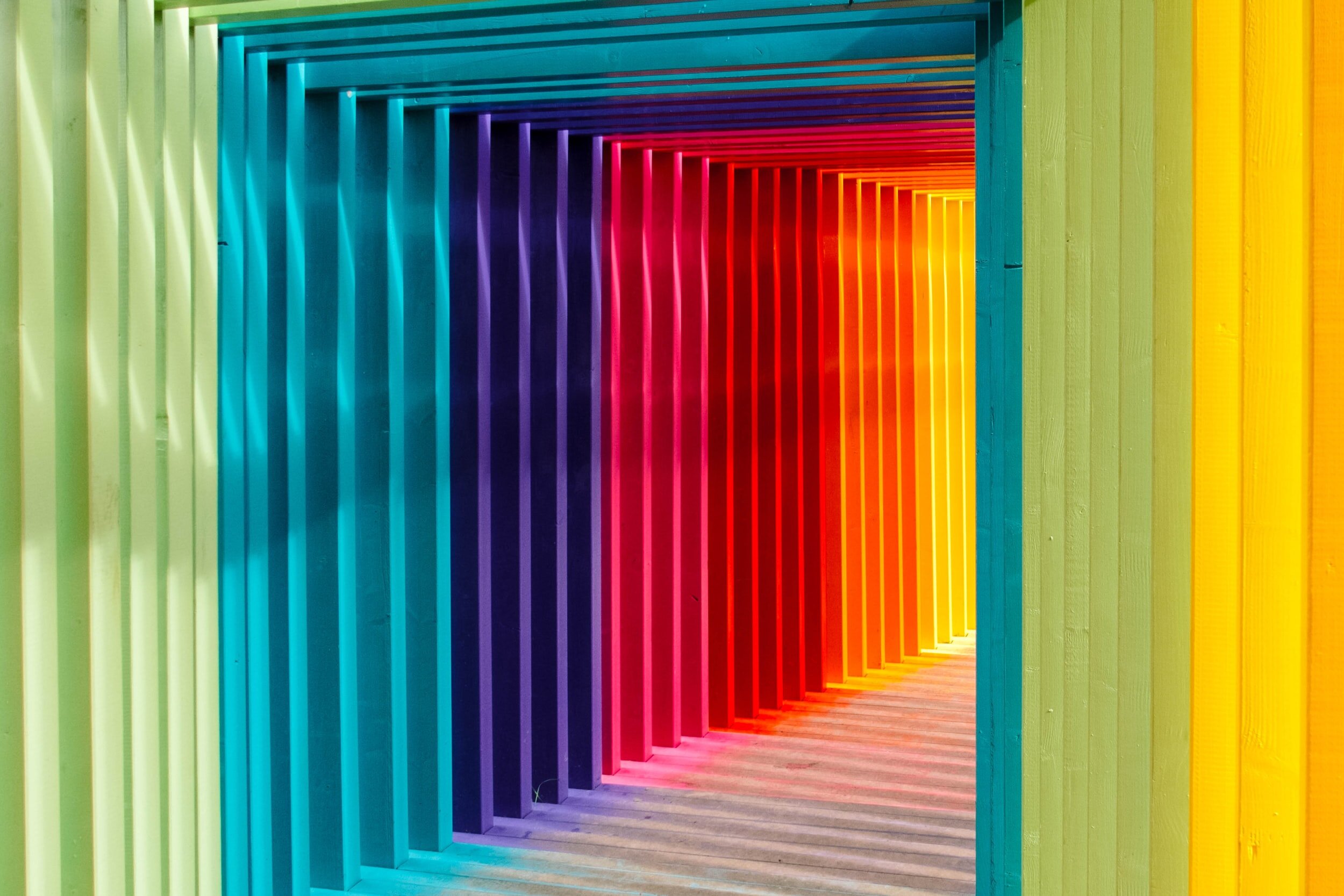
Do you know that colour can affect your emotion? In marketing, colour plays an important role in how your brand you perceived. Are you trying to connect to a youthful audience or looking to build relationships with other brands? The colour that you use would make you stand out from the crowd and attract your ideal customers. In this article, you will learn more about colour psychology and the meaning behind colours.
Content:
1. What is colour psychology?
Colour psychology is the study of colours concerning human behaviour. In this subject, we can learn how colour influences our decisions. Would a colour compel us into purchasing a product? Does the colour of a button push us to click on on it? Colour have meanings too. The same colour may have different meanings based on several factors such as culture, gender, childhood memories, etc.
2. Why is colour important in marketing?
Colour evokes feeling. Choosing the right colour for your marketing effort can help your brand to stand out from the crowd. By using colours strategically, you can get your audience to see what you want them to focus on. Colour can influence a person behaviour. Likewise, poor colour selection can damage your brand image too. For example, if you choose the wrong colour for your content, it would be hard for your audience to read the text. Your audience may ignore you due to this mistake. This is why marketers and designers need to have a good understanding of colours.
3. The meaning of colours
1. Red
Red attracts the most attention and is associated with strong emotions such as love, passion, excitement, danger and anger. Red is the most intense colour, which is why it provokes the strongest emotions.
Red works well for sale icons if the colour contrasts well with the website colours. Use red for your call to action button to compel someone into clicking the button.
2. Orange
Orange is more gentle than red. Hence, the colour is less commanding than the colour red. It represents creativity, adventure, fun and success. You can use this colour to draw attention too. Similarly, you can use it on the call to action buttons.
3. Yellow
Yellow promotes feelings such as happiness, positivity but also warning. You can use this in your brand so that it can brighten your audience's spirits. However, too much yellow can cause anxiety and agitation.
4. Green
Green is associated with nature and money. It means growth, generosity, stability and harmony. On the flip side of the coin, it can represent envy or jealousy too. If your brand revolves around nature, you can use green as one of your brand colours.
5. Blue
Blue is the colour of trust, peace and calmness. Blue can also bring a sense of coldness. Tech brands, such as Facebook and Twitter, often use blue in their marketing. Verified icons are in blue because the colour can strengthen the trust.
6. Purple
Purple is a royal colour. It is connected to luxury, wisdom and spirituality. It is often used to denote high-quality products. You can use purple in your marketing to promote premium services.
7. Pink
Pink is a feminine colour. It promotes playfulness and unconditional love. Pink is primarily used in campaigns targeting female consumers. For example, Victoria's Secret and Barbie.
White refers to innocence and cleanliness. White is commonly used on websites because web pages will likely have a white background with black font. This is the best colour combination for readability.
9. Black
Black is the colour of power, elegance and sophistication. Think Chanel. Black is a popular colour for text as it is an easy colour to read.
10. Grey
Grey represents neutrality and balance. The neutral colour does not put anyone off.
4. Colour vs Consumer Behaviour
As discussed in the above segment, different colours have a range of effects on us, from boosting positive to negative emotions. So, how do marketers work this into the campaigns?
The usage of colours in advertisements is crucial. Think Shopee ads. The main colour of their brand is orange. This creates a sense of association with their brand. Hence, whenever you see an advertisement in orange, you would think of Shopee.
Have you realised that washing powder brands like to use white clothes in their advertisement? White represent cleanliness. By using a white shirt, it advocates the effectiveness of the product.
Car advertisements have a tendency to use a black, grey or red car in their campaigns. Black provokes sophistication and elegance. Grey can mean a neutral state or innovation. Red promote passion and excitement. Depending on the tone of the message, different colours of the car would be used.
That's how marketers make you hook! Colour play an important role in marketing. With the correct selection of colours, it will increase the success of your marketing strategies.
I hope this article has helped you to learn more about colour in marketing.
x, Esther

I welcome suggestions and collaboration. Feel free to drop me a note at hello.estherp@gmail.com.


